Tableau is one of the best Data Visualization tools which is mostly used for Business Intelligence. It helps to gain business insights by using visual elements like charts, graphs, and maps to see and understand trends, outliers, and patterns in data.
In this article, I am going to talk about the 10 things that make Tableau the most efficient tool for data visualization.
If you are a data scientist then you would relate to the frustration that large unsorted data sets can give us. Finding patterns, looking for data trends, finding useful information etc becomes impossible in such data sets. Tableau can help us in all of these problems in a very sophisticated manner.
Tableau comes in two versions, one is Tableau Public that is free of cost while another is Tableau Desktop that is a paid app. We will be discussing 10 things that make Tableau Public the ultimate data visualization tool.
1. Installation and inter-app communication
The installation of Tableau Public is very easy and requires only your e-mail to download the application. And this app runs both on Windows and MacBook. Once installed there is no supporting files or complex download selection required as everything is given at its best by the company.
Tableau can connect to different file apps in your computer so that you can analyze and visualize varied data. It can access all kinds of files like MS Excel files, JSON files, PDF files, etc suited best for making a dataset and that’s what makes it the best platform.
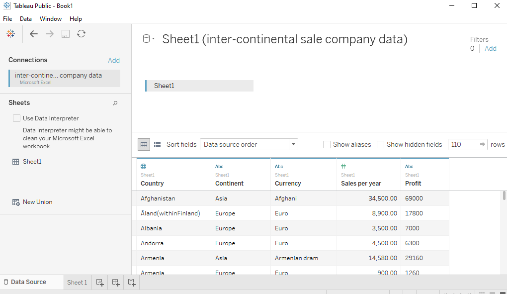
To understand further features of the application, we will need an example. Let’s take the example of an inter-continental sales company operating from Europe. Let’s take this sample data set of this company’s sales in 2019 to visualize in Tableau. Now, we are going to open it in the Tableau application.
2. Drag what you want and drop where you want
In “connections” on the left table, you can see the file you are connected to. Drag that sheet and drop it in the canvas to see the options you got, it may take some time to load the file so be patient. It is easy to start the analysis of the data in Tableau.
In the left corner again, you will see now that Data pane and Analytics pane have appeared. In the data pane, you will have dimensions and measures, automatically made for you by the software.
3. Various data visualization views and projects
Under “show me” section just on the right side you can see varied views. You can choose the view you want to visualize your data in. However, if you don’t then by default the Mark type (on the left side) is set to “Automatic” and data is shown the way tools finds it should be understandable.
Suppose you want to visualize the sales in Asia, Europe, and Africa. So now, you will make them as regions and their sales as measures you want to measure them on.
Again, drag the regions in the column bar. It will show up blue after the drop and sales in the row bar it will show up green after the drop to get a graph of your data.
This is how your tab will look like. Under Dimension, you will see “Country” and under Measures, you will see “Sales per year”.
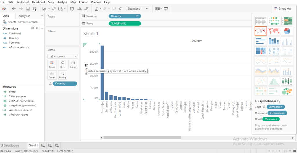
This is how it looks likes when you drag the “Country” is measured against Sales per year.
Just in front of “Profit” in the graph, there will be a small icon, click on the icon to sort the data the way you want. You can do the same with “Country”.
Tableau is not limited to a specific type of project but rather it provides you with 3 different project options that can change the way you ever visualized your data with.
The three different projects are:
Worksheet: It can be a single excel sheet that provides you with insightful and brilliant information in a single view.
Dashboards: You can make up a dashboard of more than 1 worksheets. This will provide you with the benefit of showing your data in multiple views making it more visualized to the audience.
Story: There are many types of worksheets that somehow are interlinked. The audience will be at first interested in seeing all of them but after some time everything will seem repetitive and it will be hard to recognize what was noted before. With this feature, you can create a narrative of data by placing all the views in an order that supports your context.
4. Aggregation And Granularity
This feature makes it a professional app in terms of data visualization. As said above, data is divided into “dimensions” and “measures”.
To have a clear understanding of what these are, think dimensions as data that can be distinguished among each other, say sex, region, different products, etc. Meanwhile “measures” can be thought of as data that can be measured such as sales, rates, profits, losses, etc.
Suppose, you are measuring sales in different regions [dimensions]. Let’s say you take out region from the graph but still data will be shown, however, on a single row. So, now you are left with an aggregate sum of sales as a whole in the given time.
By adding dimensions, we add granularity to the scenario because now the data is measured for each region separately.
Now, suppose I want to know the sales of Asian countries too. I will add a country as a sub-dimension to the already dimension region. The data now is clearer and specific.
5. Preattentive Visual Properties
These properties give Tableau the look of an advanced data visualization tool. The Preattentive Visual properties include Length, Shape, Size, Colour, and Position.
Again, taking the example of Asia, Europe, and Africa Sales of a company’s dataset.
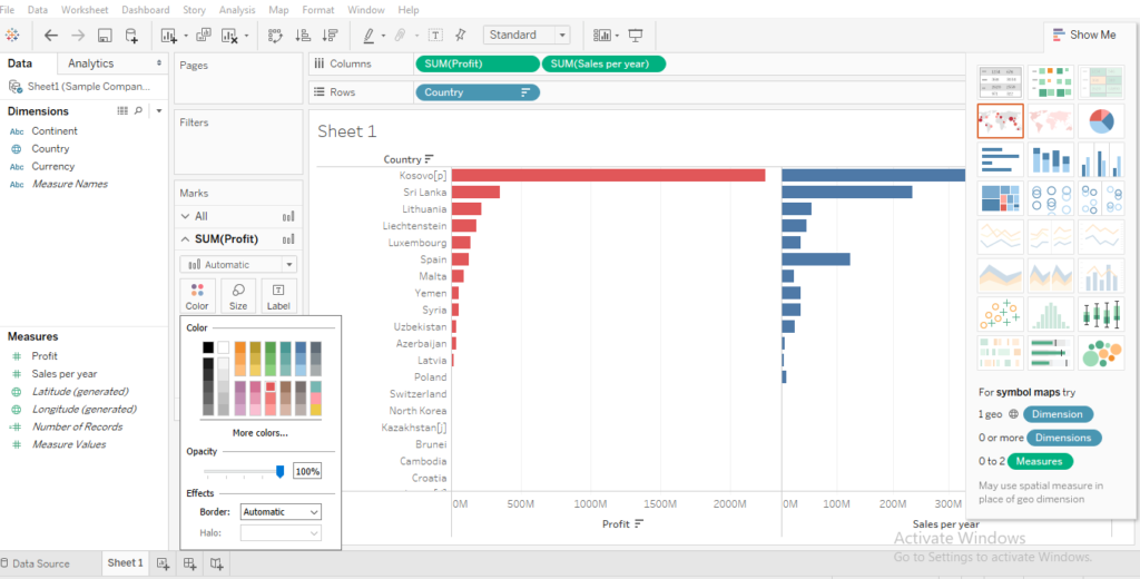
a) Length is typically shown using a bar graph in which furthermore positioning can help sorting data in a specific order to know more information and analyze data in a better manner.
b) Amongst all of three continents, the length will help show the maximum and minimum sales whilst positioning will help reposition specific category at any place in the graph by simple drag and drop.
Aside from these features, you can also make use of Size, Colour and Shape to visualize your data differently. All of these features are available nearby in the left panel called Marks.
6. Reference Line for indicating a key-value
How many times does it happen when we are not able to a quantitative comparison amongst various values? This feature applies a reference line on the given graph you visualize your data on. Thus, it makes it easy to see where we have done growth and where we have lagged behind in given times.
To get this feature, Go to Analytics Pane -> Custom -> Reference Lines and then you can apply it on
1. Whole Table
2. A Pane
3. A cell
You can also search between the various parameters to get values based on SUM, average, etc. There are various options that you can make use of that will make your data visualization experience in Tableau amazing.
7. Visualize Data Trends Overtime
Usually, tables do not show how data evolves over time. Everything in a table looks unsorted and unspecified thus getting better information and note data trends becomes hectic.
With Tableau, it has become possible to see how the data is changing over a period of time. We can note the data patterns, data trends, and data changes and compare them over different periods of time.
Data prediction also becomes easy when you have a clear idea of what is happening. For example, you note that the sales in India Sub-region of Region Asia are boosting up near October and November in the past few years.
You can look for the events happening during that you come to it is due to the Diwali festival that people are buying different things. For the next year, you can plan on launching new products in festival times in India.
You can note similar things for Europian and African countries and predict the next year’s sales based on the sales trends of the past few years. It brings us to the feature that can help us in doing called “Filters”.
8. Applying filters to analyze data
Just when we think this is the best that can be done, Tableau brings more to amaze us.
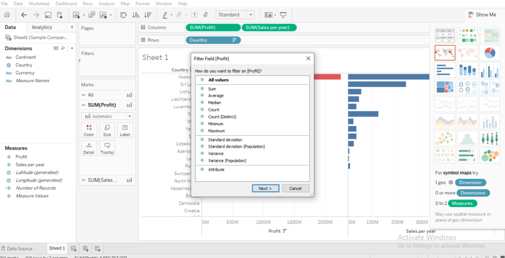
A filter is one such thing that you can apply to your data to know better about your data. Let us suppose you want to see the Sales date amongst all your sales.
Now, simply drag the “Sales date” from data pane onto the filter shelf. The filter shelf gives us options on how we want to view our data. Let’s go with “range of dates” because you can analyze your data based on your choices through this; now click next.
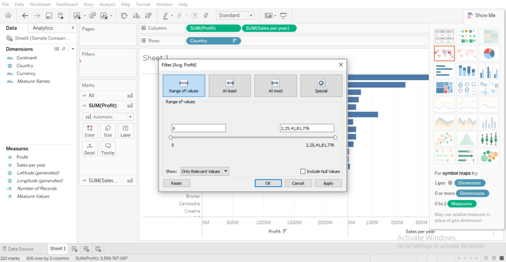
Now, you can change your lower and upper bound of the data ranges and click “OK”.
You won’t notice that filter has applied or not just now. To see the changes, right-click on the filter and click on show filters.
The results, thus shown, can be trimmed or narrowed down to smaller ranges just by the rightmost tab showing your filter again.
This data can be viewed on a yearly, monthly, quarterly, etc basis. Isn’t that amazing? You are again getting granularity with this feature.
There are various other filters that you can use about that shall be discussed separately in coming posts.
See the images below and look there is “Filter” in the upper left corner. Please click on this filter and seek the options suitable for your data.
The next step after the above image is this.
9. Mapping Function
You are going to love this feature because not only this feature is delightful to eyes but also insightful to brains.
Let’s again think of the sales example. Suppose you want to see amongst various countries where are the sales happening and on what rates. Using the Mapping function, you can view various countries geographically and note the trends in sales.
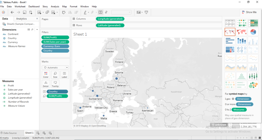
You can see which side of the world is interested in which products. This data can be successful in launching similar products or upgrade existing products in the preferable market.
Let’s say your Spray tans are popular amongst the UK and three or four other European countries. So, now an advanced Spray tan will be sold better in the UK, hence, you should launch it there.
10. In-built Colour Vision Deficiency Pallets
Colour blindness is a lot more common than we think. It is an estimate that 8% of males and about 1% of females suffer from colour blindness.
However much colourful your data representation is, to them it would seem bland as their vision is not normal.
Tableau brings a revolutionary feature to support these people by providing an inbuilt colour vision deficiency pallet to your data.
There will be different colours but all of them will still be distinguishable to people suffering from different forms of colour blindness.
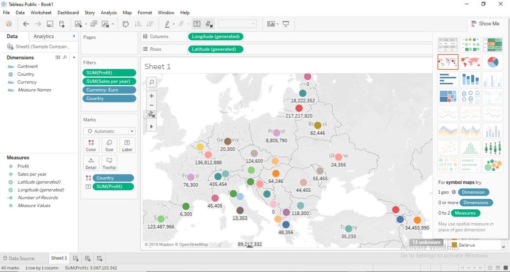
See the image above, look closely in the filters and you will notice that the filter applied is “Currency”. In the map of Europe, these are the countries that accept EURO. A
ll these colours are auto selected by the tool itself. Just click on the small icon in front of Country and you can see these dots in different markings. A colour blind person will be able to recognize all the colours.
That means, your data trends will be seen by one and all equally and you can make everyone’s experience common.
Conclusion: Tableau is not only an advanced application that is great with data visualization but also it is very user-friendly due to its easy Drag and Drop feature in almost every aspect of the app. In this article, we learnt about various aspects of this software and why is so easy to create awesome data visualizations. I will be happy to hear your your opinions in the comments.