Google data studio is a reporting and dashboard creation tool which integrates with many platforms and is easy to customize. It makes data visualization easier and helps in taking key business decisions using reports. Right now it’s being offered for free for Google account and Google cloud platform users.
You can create many reports using Google data studio but in this post I am specifically talking about creating Facebook ads report.
Connect Facebook Ads with Google Data Studio
To get Facebook ads data into Google data studio you need to create a data source and use a Facebook ads connector.
There is a connector available for Facebook ads from a company called Supermetrics.
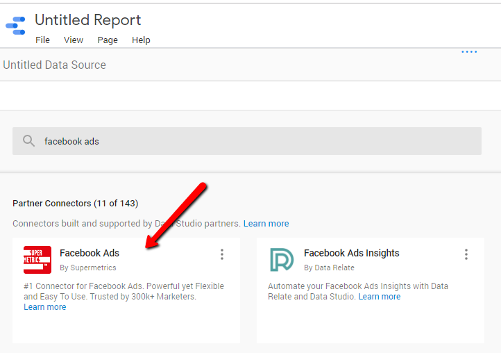
You have to select that and connect your Facebook Ads account with it. They offer a 14 day free trial period to access its full capabilities.
Here are the 10 tips to improve your Facebook report:
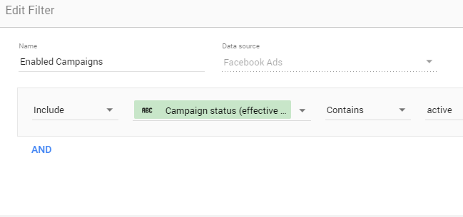
1. Create a filter to exclude paused campaigns data
Sometimes you don’t want to display your paused campaigns data. For e.g if you have created a table to quickly check all the campaigns going above your desired CPA goals, you don’t want this table to highlight paused campaigns to you having high CPA as you have already paused them.
So you can create a filter to select only enabled campaigns.To create the filter select metric “Campaign status (effective status)” and do these settings –
2. Give custom names to some Facebook metrics
Some facebook metrics have long names and sometimes they are not displayed completely in charts or tables. You also can’t expand these charts or tables to display complete metric names as there are other elements on the page right or left to them.
For e.g when you are creating a table with many columns, these names are not displayed completely in the table heading. See the example below –
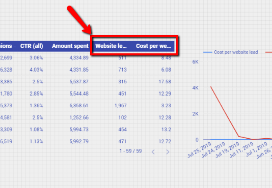
In the above screenshot metrics like “Website Leads” and “Cost Per Website Lead” can be changed to “Leads” and “CPL” respectively.
In the data tab hover your mouse on the text “SUM” which is left to your metric name and you’ll see a pencil icon.
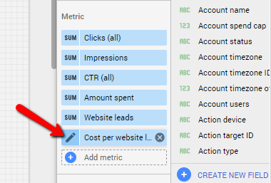
Click on it and change the name.
3. Use Facebook brand color in the report
You can use the Facebook blue color to make your report relate to the platform and look nice. Use it as the primary color in the background and choose white as text color.
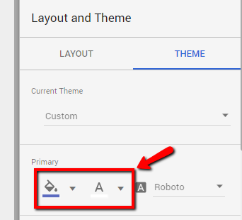
Click on any empty space in your report and then click on theme tab on the right. Then you can choose background and text colors under primary as shown in the screenshot above.
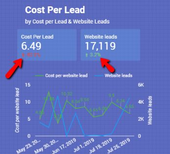
4. Use opacity to make awesome looking scorecards
When you are using scorecards to display some information, you can choose a light background color for them matching with main primary color and with the less opacity value. For e.g look at this screenshot below –
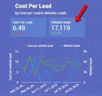
I have chosen a light blue color (lighter than the main background) for this scorecard and made it less opaque so that background color is visible through it. This can be done from color settings of your scorecard –
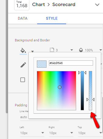
Make sure you don’t decrease the opacity to 0% as that will make your scorecard background transparent.
5. Chose comparison colors wisely
When you are using a scorecard, you get option to implement comparison colors to show changes in the data. Normally it’s green for increase and red for decrease in the values.
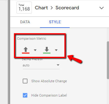
It will compare your metric with the same previous period of whatever time frame you choose in your reports and will show percentage change in the scorecard.
But this strategy of giving green color for increase and red for decrease in values does not fit well for some metrics where decrease in their value is actually a positive change.
For e.g Cost Per Lead metric in the above screenshot. For this metric I have reversed the colors and have given red for increase and green for decrease.
6. Use Heat Maps to highlight important data in tables
When using tables in Google data studio we can choose heat maps to highlight most important data in our columns. For e.g see the table below –
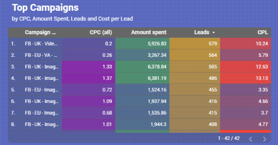
This table uses heat maps for each column which you can do from the table settings here –
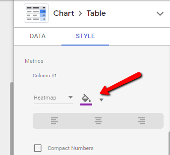
You can choose different colors for each column and also set their transparency level.
7. Use sorting to display important data
You can use sorting to display data according to your needs. For e.g in the above screenshot of table, I have sorted leads in descending order so that I can see all the campaigns displayed on top that brought maximum leads.
This was done by choosing website leads metric in the sorting section in the data tab.
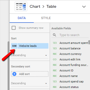
You can also choose secondary sort and select other metric if you want to further sort something in your sorted list.
8. Use default date range setting to show latest data
You can choose a default date range to always show data in that date range when someone opens your report.
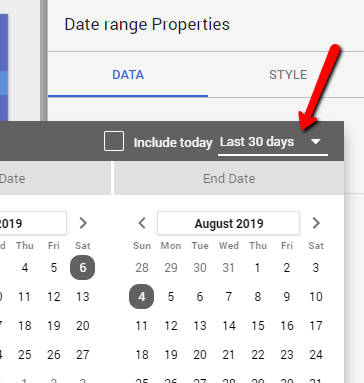
In the screenshot above, I have chosen last 30 days as default date range so whenever someone will open my report, the data shown to him will be for last 30 days from his present date.
9. Use start date as a dimension
While creating charts for Facebook ads in GDS we have to select a dimension. It is shown at the bottom of the chart and it is the way to segment our data in the chart.
Most of the times we choose campaign names as dimension but if there are lot of campaigns on our facebook ads account, this is not properly displayed at the bottom of the chart.
In this case you can select “start date” as dimension and also sort by “start date” in ascending order.
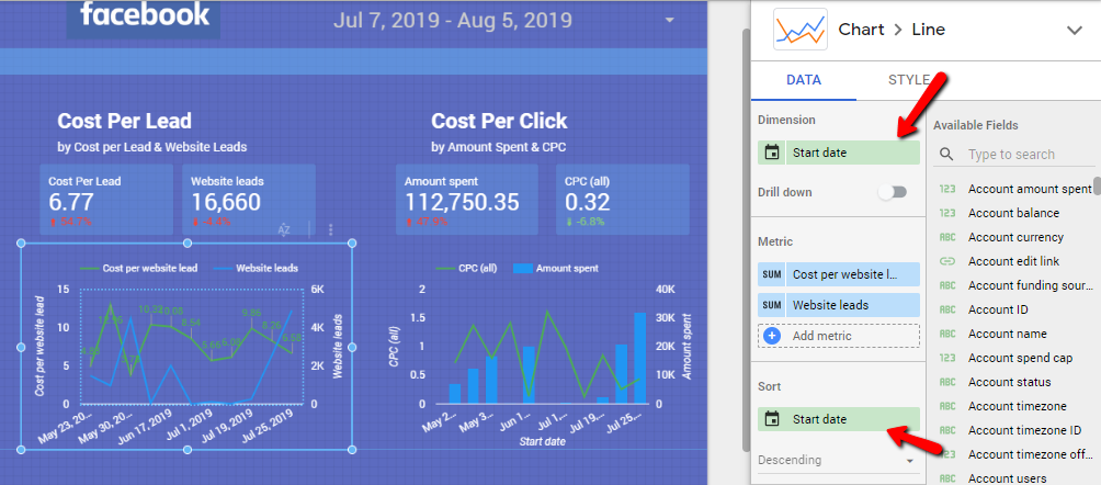
You’ll get a good time series chart displaying changes in the metrics in different intervals of time. Start date is actually the ad set start date here so it will show random dates on the chart when your ad sets started running.
10. Use Pie charts to represent segmentation
Pie charts look cool when we want to show data based upon different segments like devices, age group, gender, location etc.
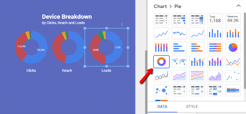
In the chart above I have segmented the data by device type. So with pie charts it’s easy to see which devices are getting more leads, reach and clicks.
Conclusion: So these were the ten tips to improve your Facebook ads report in Google data studio. I think there can be a lot more tips that can be added but I have just mentioned the ones I came across while making Facebook reports for my clients. I hope these tips will be helpful for you.